Saturday, November 21, 2015

15 best free responsive jQuery image sliders

15 best free responsive jQuery image sliders
Image sliders are the best way to highlight your prior content on homepage/landing page. In the vast web world you may find a large number of Image sliders, and maybe you don’t have sufficient time and patient for checking all of them out. So here I tried to scale down the number to 15 and presenting 15 of the best free, responsive and latest tech enriched content sliders. See their demo and download them, then use them on your project. Read on:

1. FlexSlider

FlexSlider

 
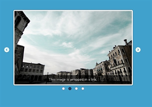
An awesome, fully responsive jQuery slider toolkit.     
  • Simple, semantic markup    
  • Supported in all major browsers    
  • Horizontal/vertical slide and fade animations    
  • Multiple slider support, Callback API, and more    
  • Hardware accelerated touch swipe support    
  • Custom navigation options    
  • Compatible with the latest version of jQuery
Demo
Download

2. unslider

 unslider


unslider is a responsive and cross-browser jQuery plugin for creating clean and flexible content sliders on your web site. unslider currently supports almost all the html elements like image, text, video, etc.    
  • Lightweight (~3kb minified) and easy to implement    
  • Responsive and cross-browser    
  • Keyboard and Dot navigation support    
  • Customizable transition animations    
  • Touch & Swipe support    
  • Prev/Next button support
Demo
Download

3. Ideal Image Slider 

Ideal Image Slider


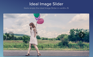
The aim behind the Ideal Image Slider is to create a slider which has just the right amount of features, with no bloat and be easy to extend so that more features can be added as “extensions”. Here are the ideals and core features:     
  • HTML5 (SEO optimised)    
  • CSS3 transitions (a few simple transitions like slide/fade)    
  • Left/Right navigation (including touch/swipe support)    
  • Responsive    
  • HiDPI (retina) support    
  • ARIA support    
  • Extremely simple to setup (no dependencies)    
  • Very extensible    
  • Uses progressive enhancement
Demo
Download

4. Slider Pro

Slider Pro


Slider Pro is a professional jQuery plugin which allows you to display a group of mixed content in a responsive and touch compatible slider. Key Features:     
  • Fully responsive with custom JS breakpoint.    
  • Touch swipe, keyboard, and thumbnails navigation.    
  • Fullscreen and auto height support.    
  • CSS3 powered transitions.    
  • Infinite loop like a carousel.    
  • Image lazy load.    
  • Retina image support.    
  • Galley lightbox enabled.    
  • Automatic video handling.    
  • Supports mixed content, not only images.
Demo
Download

5. jSlider

jSlider


jSlider is a simple, lightweight, full-featured jQuery plugin for creating animated content / images on your webpage / web applications. Features:     
  • Mobile-friendly. Support both mouse drag and touch swipe to switch between slides.    
  • Cross browser. Supports all major browsers and even IE 8/9/10.    
  • Options can be passed via data-attributes directly in the markup.    
  • Arrows and dots navigation.    
  • Custom animation types.   
  •  Fully responsive for any screen size.    
  • 3 built-in slider modes (slide, fade & gallery) to fit your any needs.    
  • Supports infinite looping that makes the slider act like a carousel.    
  • Auto resize slider content to fit parent container.
Demo
Download

6. Slippry

Slippry


Responsive slider plugin for jQuery. Intrinsic trick to enable responsive resizing without js!
  • Slippry is a pretty customization slider, included some (slightly random) combinations of options and the function settings and CSS (if applicable) to recreate them. 
  • Designs/styles: Out-of-the-box, Pictures, Portfolio, News, Shop, Thumbnails, CSS vs jQuery.
Demo
Download

7. Hero Slider

Hero Slider


It is a common approach to fill in the intro section of a website with a slideshow: you’re trying to show the users as much as you can above the fold, yet you want to deliver this information in an organized and clean way.  Therefore we built for you a ready-to-use jQuery slider, with some built in options like video/image backgrounds and different text alignments. In an attempt to increase user engagement, we replaced the “navigation arrows” with buttons. The difference is: buttons have a title, a hint about what kind of content to expect. Arrows just tell users “you can switch slide”.

Demo
Download

8. jQuery lightSlider 


 jQuery lightSlider


jQuery lightSlider is a lightweight responsive Content slider.  Features:     
  • Fully responsive – will adapt to any device.    
  • Supports touch devices and swiping.    
  • Gallery mode to create an image slideshow with thumbnails    
  • Small file size (6kb) (minified), fully themed, simple to implement.    
  • CSS transitions with jQuery fallback.    
  • Full callback API and public methods.    
  • Auto play and auto loop to create a content carousel.    
  • Keyboard, arrows and dots navigation.    
  • Chrome, Safari, Firefox, Opera, IE7+, IOS, Android, windows phone.    
  • Slide and Fade Effects.    
  • Multiple instances on one page.
Demo
Download

9. Zenith

Zenith


Zenith is responsive slider jquery plugin that comes in 4 basic layouts and 7 transition animation available
  • 4-th layout, or slider layout, has some variations of its own, producing 3 more pre-defined sub-layouts and unlimited possibilities of styling, editing and creating some of your own variations.
  • You can edit some HTML, and add that markup by passing it’s elements classes or id’s to the options when initializing zenith. 
  • Zenith differs from other responsive slider jquery plugins in dozen ways.
  • It’s unique layouts for showcasing highlights will enhance your product, or app presentation.
  • You can style almost every part by passing your own custom CSS directly into options, without even touching the main style.
Demo
Download

10. SmoothSlides 


A responsive jQuery slideshow with beautiful panning effects on each image.

Demo
Download

11. jcSlider

jcSlider


A responsive slider jQuery plugin with CSS animations.This plugin does not use jQuery animations. Only CSS3, because performance matters. No need to calculate distances, sizes or whatever, only add and remove classes to elements to animate them. It couldn’t be easier!     
  • Only 1 js file, 1Kb minified    
  • Responsive    
  • Multiple effects (more than 60!)    
  • Works with html, images… whatever you want to animate
Demo
Download

12. Responsive Layered Slider with CSS3 & jQuery

Responsive Layered Slider with CSS3 & jQuery


The entire slider works by using just a JavaScript document and you don't have to attach any CSS style sheets to use it.
  • Each layer will have 18 possible effects which you can use to your liking. 
  • All animations are created by inserting CSS code into the page using JavaScript
Demo
Download

13. Zoom Slider

 Zoom Slider


A simple content slider with depth-like zoom functionality for a predefined area in each slide. Each slide has a predefined zoom area that will be used to calculate the appropriate scale value for a fullscreen fill.  Once the icon for zooming is clicked, the zoom area as well as the page get scaled, creating the illusion that the viewer is approaching the item. Once the whole page is covered, it shows some more details.

Demo
Download

14. PgwSlideshow

PgwSlideshow


Responsive slideshow / gallery / carousel for jQuery / Zepto     
  • Fully responsive slideshow    
  • Desktop and Mobile devices supported    
  • Less than 4 KB (minified and gzipped)    
  • Full customization with the CSS file included
Demo
Download

15. slider.js

slider.js


slider.js is a lightweight, simple-to-use jQuery plugin that helps you generate a fullscreen, responsive slider carousel for showcasing your photos, designs and stories.

Demo
Download

So what you think about this list don’t forget to mention. More Cool slider information base list will be publish soon, so stay subscribed. Goodluck…..

Friday, November 20, 2015

How to create Vertical text/link navigation menu

How to create Vertical text/link navigation menu
The navigation menu styles we mostly see around on web are sidebar menu, vertical menu, fixed to header menu etc. It’s very rare to spot a site with vertical text/link style menu, right? So here it is I developed this vertical text/link style menu which offers; links are hanging from top side of site, and links will be shown vertically. This menu made with CSS3 transform formula to make links appear vertically and added opacity effect and cheerful flat color to each link enhanced with Google web font. Let’s see how it looks like and to create this menu. Read on-

How to create Vertical text/link navigation menu

How to create Vertical text/link navigation menu

How to:
Step 1: First create a navigation class; and all positioning codes-

.nav {
    position: relative;
        float:right;
        top: -3px;
}


Step 2: Here we design the nav’s li elements; with CSS3 transform: rotate(-90deg); width; text positioning and <li> positioning.

.nav ul li {
    -webkit-transform: rotate(-90deg);
  -moz-transform: rotate(-90deg);
  transform: rotate(-90deg);
    width: 100px;
    overflow: hidden;
    padding:5px 10px 10px 18px;
    float: left;
    background-color: #7f9db9;
    text-align: left;
    margin-left:-50px
}


Step 3: Now designing the ‘a link’ elements with font style, size, decoration and color.

.nav ul li a {
    color: #fff;
    text-decoration: none;
    display: block;
    font-family: 'Josefin Sans', sans-serif;
    font-weight:500;
    font-size:16px;
}


Step 4: Then individual color and hover color setting up for <li> elements with rgba color codes; we creating 5 link slot so setting up their color respectively with l1, l2, l3, l4 and l5 <li> classes.

.nav ul li.l1 {
    background-color: rgba(243, 156, 18,0.65);
}
.nav ul li.l1:hover {
    background-color: rgb(243, 156, 18);
}
.nav ul li.l2 {
    background-color: rgba(207, 0, 15,0.65);
}
.nav ul li.l2:hover {
    background-color: rgb(207, 0, 15);
}
.nav ul li.l3{
    background-color: rgba(54, 215, 183,0.65)
}
.nav ul li.l3:hover {
    background-color: rgb(54, 215, 183);
}
.nav ul li.l4{
    background-color: rgba(25, 181, 254,0.65)
}
.nav ul li.l4:hover {
    background-color: rgb(25, 181, 254);
}
.nav ul li.l5{
    background-color: rgba(65,117,160,0.65)
}
.nav ul li.l5:hover {
    background-color: rgb(65,117,160);
}


Step 5: It’s time to call ready CSS classes to HTML; So I’m using a <div> to call .nav you may call it under <nav> for integrating design to HTML5. Adding <ul>, <li> and <a> elements. And finally finishing the design.

    <div class="nav">
        <ul>
            <li class='l1'><a href="#">Home</a></li>
            <li class='l2'><a href="#">Blogger</a></li>
            <li class='l3'><a href="#">Wordpress</a></li>
            <li class='l4'><a href="#">About</a></li>
            <li class='l5'><a href="#">Contact</a></li>
        </ul>
    </div>


Step 6: Place links in "#" and change anchor texts as you like. Change color code of <li> with your desired rgba color. And here are the full codes of this vertical text style navigation menu:

<!--crawlist.net HTML starts-->   
<div class="nav">
        <ul>
            <li class='l1'><a href="#">Home</a></li>
            <li class='l2'><a href="#">Blogger</a></li>
            <li class='l3'><a href="#">Wordpress</a></li>
            <li class='l4'><a href="#">About</a></li>
            <li class='l5'><a href="#">Contact</a></li>
        </ul>
    </div>
<!--crawlist.net HTML ends-->    
<style>/*crawlist.net CSS starts*/
@import url(https://fonts.googleapis.com/css?family=Josefin+Sans);
.nav {
    position: relative;
        float:right;
        top: -3px;
}
.nav ul li {
    -webkit-transform: rotate(-90deg);
  -moz-transform: rotate(-90deg);
  transform: rotate(-90deg);
    width: 100px;
    overflow: hidden;
    padding:5px 10px 10px 18px;
    float: left;
    background-color: #7f9db9;
    text-align: left;
    margin-left:-50px
}
.nav ul li a {
    color: #fff;
    text-decoration: none;
    display: block;
    font-family: 'Josefin Sans', sans-serif;
    font-weight:500;
    font-size:16px;
}
.nav ul li.l1 {
    background-color: rgba(243, 156, 18,0.65);
}
.nav ul li.l1:hover {
    background-color: rgb(243, 156, 18);
}
.nav ul li.l2 {
    background-color: rgba(207, 0, 15,0.65);
}
.nav ul li.l2:hover {
    background-color: rgb(207, 0, 15);
}
.nav ul li.l3{
    background-color: rgba(54, 215, 183,0.65)
}
.nav ul li.l3:hover {
    background-color: rgb(54, 215, 183);
}
.nav ul li.l4{
    background-color: rgba(25, 181, 254,0.65)
}
.nav ul li.l4:hover {
    background-color: rgb(25, 181, 254);
}
.nav ul li.l5{
    background-color: rgba(65,117,160,0.65)
}
.nav ul li.l5:hover {
    background-color: rgb(65,117,160);
}
/*crawlist.net CSS ends*/</style>


Compatibility:
  • This menu is compatible with all latest version of web browsers.
So what is your opinion about this navigation menu don't forget to mention, Chill....

Tuesday, November 17, 2015

Overlay style navigation menu for Blogger

Overlay style navigation menu for Blogger
In my past posts I published two different position style navigation menus, Fixed to header and static position menus, here I am publishing a new style of menu it’s calls Overlay style; full navigation will appear top-left side of your blog interface with bar/burger style trigger and hover on the trigger will show full navigation menu on a full screen overlay page. It also responsive so also works seamlessly on mobile devices; it has an extra close button in case automatic overlay closing function unable to work. Made with CSS, CSS3, HTML, Google font let’s see how it looks like and how to add it to your blogger blog.

Overlay style navigation menu for Blogger


Live Demo:

(Click here)

Codes for Copy:


<div class="menu-outer">
    <div class="menu-icon">
        <div class="bar"></div>
        <div class="bar"></div>
        <div class="bar"></div>
    </div>
    <!--crawlist.net widget starts-->
    <div class="nav">
        <ul>
           <li><a href="#">Home</a></li>
           <li><a href="#">Blogger</a></li>
           <li><a href="#">Wordpress</a></li>
           <li><a href="#">About</a></li>
           <li><a href="#">Contact</a></li>
       </ul>
   </div>
   <!--crawlist.net widget ends-->
</div>
<a class="menu-close" onClick="return true">
    <div class="menu-icon">
        <div class="bar"></div>
        <div class="bar"></div>
    </div>
</a>


<style>
/*crawlist.net CSS starts*/
@import url(https://fonts.googleapis.com/css?family=Montserrat);

.menu-outer:hover ~ .menu-close {
  margin-right:-100px;
}
.menu-outer:hover .bar { background:rgba(100,200,240,.9); }
.menu-outer > .nav ul { top:15%; }


.menu-outer {
  overflow: hidden;
  position: fixed;
  top: 0;
  font-family: 'Montserrat', serif;
  z-index: 998; 
  width: 100%;
  left: 100%;
  margin-left: -100px;
  height: 200%;
  background:rgba(100,200,240,.9); 
  -webkit-transition: all ease .5s;
  -moz-transition: all ease .5s;
  -ms-transition: all ease .5s;
  -o-transition: all ease .5s;
  transition: all ease .5s;
  -webkit-transform-origin: top left;
  -moz-transform-origin: top left;
  -ms-transform-origin: top left;
  -o-transform-origin: top left;
  transform-origin: top left;
  -webkit-transform: rotate(-45deg);
  -moz-transform: rotate(-45deg);
  -ms-transform: rotate(-45deg);
  -o-transform: rotate(-45deg);
  transform: rotate(-45deg);
}
.menu-outer:hover {
  background: rgba(100,200,240,.98);
  left: 0;
  margin-left: 0;
  -webkit-transform: rotate(0deg);
  -moz-transform: rotate(0deg);
  -ms-transform: rotate(0deg);
  -o-transform: rotate(0deg);
  transform: rotate(0deg);
}
.menu-icon {
  z-index: 999;
  position: absolute;
  top: 58px;
  left: 15px;
  width: 30px;
  pointer-events: none;
  -webkit-transform: rotate(45deg);
  -moz-transform: rotate(45deg);
  -ms-transform: rotate(45deg);
  -o-transform: rotate(45deg);
  transform: rotate(45deg);
  -webkit-transition: all ease .5s;
  -moz-transition: all ease .5s;
  -ms-transition: all ease .5s;
  -o-transition: all ease .5s;
  transition: all ease .5s;
}
.menu-icon .bar {
  background: rgba(250,250,250,1);
  width: 100%;
  height: 5px;
  margin: 0 0 5px;
  -webkit-transition: all ease .5s;
  -moz-transition: all ease .5s;
  -ms-transition: all ease .5s;
  -o-transition: all ease .5s;
  transition: all ease .5s;
}
.menu-outer:hover > .menu-icon {
  opacity: 0;
}
.nav ul {
  position:absolute;
  width:100%;
  padding: 0;
  left: 10%;
  -webkit-transition: all ease .5s;
  -moz-transition: all ease .5s;
  -ms-transition: all ease .5s;
  -o-transition: all ease .5s;
  transition: all ease .5s;
}
.menu-outer:hover > .nav ul {
  left: 0;
}
.nav li {
  list-style:none;
  text-align: center;
  text-transform: uppercase;
}
.nav li a {
  font-size: 2em;
  color: rgba(255,255,255,.8);
  text-decoration: none;
  margin: 0 auto;
  padding: 20px;
  display:block;
  -webkit-transition: all ease .5s;
  -moz-transition: all ease .5s;
  -ms-transition: all ease .5s;
  -o-transition: all ease .5s;
  transition: all ease .5s;
  text-align:center
}
.nav li a:hover {
  color: rgba(255,255,255,1);
}
@media screen and (max-width: 600px), screen and (max-height: 600px) {
  .nav ul {font-size:.75em;}
  .nav ul a {padding: 10px;}
}
.menu-close {
  z-index: 9999;
  position: fixed;
  top: 0;
  right: 100%;
  width: 200px;
  height: 200px;
  background: rgba(250,130,70,1);
  cursor: pointer;
  -webkit-transition: all ease .5s;
  -moz-transition: all ease .5s;
  -ms-transition: all ease .5s;
  -o-transition: all ease .5s;
  transition: all ease .5s;
  -webkit-transform-origin: top right;
  -moz-transform-origin: top right;
  -ms-transform-origin: top right;
  -o-transform-origin: top right;
  transform-origin: top right;
  -webkit-transform: rotate(45deg);
  -moz-transform: rotate(45deg);
  -ms-transform: rotate(45deg);
  -o-transform: rotate(45deg);
  transform: rotate(45deg);
}
.menu-close .menu-icon {
  right: 15px; left: auto;top: 68px;
  -webkit-transform: rotate(-45deg);
  -moz-transform: rotate(-45deg);
  -ms-transform: rotate(-45deg);
  -o-transform: rotate(-45deg);
  transform: rotate(-45deg);
}
.menu-close .bar {
  background: rgba(250,250,250,1);
  width: 100%;
  height: 5px;
  position:absolute;
  -webkit-transform-origin: center;
  -moz-transform-origin: center;
  -ms-transform-origin: center;
  -o-transform-origin: center;
  transform-origin: center;
}
.menu-close .bar:first-child {
  -webkit-transform: rotate(45deg);
  -moz-transform: rotate(45deg);
  -ms-transform: rotate(45deg);
  -o-transform: rotate(45deg);
  transform: rotate(45deg);
}
.menu-close .bar:last-child {
  -webkit-transform: rotate(-45deg);
  -moz-transform: rotate(-45deg);
  -ms-transform: rotate(-45deg);
  -o-transform: rotate(-45deg);
  transform: rotate(-45deg);
}

.tabs .widget li, .tabs .widget li {float:none}
/*crawlist.net CSS ends*/
</style>


How to add:
  • First log into your Blogger blog, Select your blog
  • Go to ‘Layout’ tab, select ‘add a gadget’
  • From popup menu select ‘Html/Javascript’
  • Copy the following codes and paste into content box;
  • Save template, then (follow this if you using Blogger default template)
  • Go to ‘Template’ tab; ‘Edit HTML’
  • And search for /* Tabs (using Ctrl+F or Cmd+F inside of code snippet)
  • Then delete all Tabs CSS codes 

/* Tabs ----------------------------------------------- */ .tabs-inner .section:first-child { border-top: $(header.bottom.border.size) solid $(tabs.border.color); }  .tabs-inner .section:first-child ul { margin-top: -$(header.border.size); border-top: $(header.border.size) solid $(tabs.border.color); border-left: $(header.border.horizontalsize) solid $(tabs.border.color); border-right: $(header.border.horizontalsize) solid $(tabs.border.color); }  .tabs-inner .widget ul { background: $(tabs.background.color) $(tabs.background.gradient) repeat-x scroll 0 -800px; _background-image: none; border-bottom: $(tabs.border.width) solid $(tabs.border.color);  margin-top: $(tabs.margin.top); margin-left: -$(tabs.margin.side); margin-right: -$(tabs.margin.side); }  .tabs-inner .widget li a { display: inline-block;  padding: .6em 1em;  font: $(tabs.font); color: $(tabs.text.color);  border-$startSide: $(tabs.border.width) solid $(content.background.color); border-$endSide: $(tabs.bevel.border.width) solid $(tabs.border.color); }  .tabs-inner .widget li:first-child a { border-$startSide: none; }  .tabs-inner .widget li.selected a, .tabs-inner .widget li a:hover { color: $(tabs.selected.text.color); background-color: $(tabs.selected.background.color); text-decoration: none; }

  • After doing all of these steps; save template.

How to configure:
  • Fill <a href="#">Home</a>'s # with your label links and change the anchor words;
Now check your blog out for make sure it’s working.

FAQ and Caution:
  • Tested on many template; should work perfectly on any template; if the design breaks then try to find out what breaking the design (mostly the thing disrupt the default design is, default code setting for .widget and .tabs CSS codes)
  • You may change the default color of this menu just change the background color of .menu-outer and .menu-outer:hover with any rgba or hex color;
  • Works fine on most latest updated web browsers.
SO what you thinking about this menu don’t forget to mention. Chill.....

Friday, November 6, 2015

UX/UI design tips for a captivating mobile app : Your 10 point bible

UX/UI design tips for a captivating mobile app : Your 10 point bibleBeing a mobile app development company we know that user experience can make or break a mobile app (depending on wether it’s awesome or horrendous). Mastering it right hinges on a good User Interface and right communication with the user.

For an independent developer whose sole product is a mobile app, it’s challenging indeed. And for someone who is employed as a UX/UI designer, it is even less of a joyride as the added pressure of client’s monetary investment is involved.

Further ordeals occur when the developer is dealing with payment apps where additional care has to be taken as one is tasked with designing for an acute interaction. Acute because they are dealing directly with the end user’s money. UI designing in this space requires utmost thoughtfulness because it requires a great level of attention to detail and consistency across technology touch points : from users’ as well as developer’s ends.

Sharp, efficient and secure are the watchwords for creating an awesome mobile app and they should apply to every UX on your to-do list. Also, it is essential for one to consider some factors that help in delivering an ideal app in terms of user engagement.

We create a roundup of ten simple tips, factors and aspects that every User experience/User interface designer must keep in mind before and while developing their mobile app.

Adhere to the OS guidelines for creating an exceptional app user interface

Sticking to multiple user guidelines belonging to target operating systems is a must when designing your app’s user interface. Exploring innovations with the navigation systems, touch gestures and interactions is highly recommended. This will not only enable you to achieve user interface design in an improved format but allow you to pick crucial features and reject the unnecessary ones.
Apps are analyzed rigidly before being launched on major app stores like Apple Store and Google Play. Therefore, before submitting their apps, developers must take some time out to analyse the type of apps that make it to these stores (in terms of UI/UX). They must read and follow the guidelines that have been put forth for creating the UI of an app for each OS.

Interactive design
UX/UI design tips for a captivating mobile app : Your 10 point bible

Mobile app UI designs don't give much room to work with, As a developer has to design for smaller screens and much smaller attention span, the design must work in sync with the user’s speed of thought. An ideal interface is one which is simple for novices without making it too boring for experienced ones.
And lack of screen space does not negate the need for a good interaction design.
The prime aspects of good interactive design are :

1.    It is goal driven
As a UI developer you have to design for the right user, therefore an extensive user research helps in creating a persona of those people who will be using the app. This gives you precise goals for them and tailor your app (and workflows) accordingly.

2.    Usability
If they can’t easily use it, they will uninstall it. Usability goes a long way in making an app useful. And useful, is desirable.

3.    Signifiers
Users must not have to think what each UI element does. You must use signifiers accordingly. Ex: blue underlined text means that upon clicking it, user will navigate to another page.

4.    Learnability
Users must know how to use an app interface in a short span of time, without training. It has to be instinctive. Familiar design patterns help users get accustomed to the app.

5.    Response
Users must know that their task was complete. It can be accomplished through a beep, a text prompt or something complex like a modal window. A developer must ensure that their response is beautiful and quick.

Flat design and full screen navigation

Flat design:
Sophisticated yet simple. Dynamic yet adaptable. A lot of app developers are adopting it owing to smooth user interfaces. Moreover, due to smaller file sizes, elements load faster. And this feature is very important for ecommerce mobile apps as too much time lapse can cause prospective visitors to leave their sites.
Being a trending design fashion, they give a clean structure to your mobile app. This optimizes User Experience on your app, increasing conversion. Flat user interface is the leading mobile design pattern of 2015, and it is strongly backed by Google’s design language called material design.

Fullscreen navigation:
The mobile application development and design industry has witnessed the rise of Fullscreen navigation feature. Unlike the conventional apps and pages where a typical title-banner-content-ad format is seen, in full screen navigation user is presented with a big menu having multiple actions. The prime valuable feature is that it fits very well with flat design.

Layered design:
Owing to the small screen of mobiles, panoramic view isn’t possible. This gives rise the need for layered design interfaces. For that, ther widgets should be active in the front and passive at the back.

  
Speedy path to action
UX/UI design tips for a captivating mobile app : Your 10 point bible
The user’s “path to action” should be as quick as possible.. For ex: In case of e-commerce mobile apps, the path to shopping should be made as short as possible in order to decrease the chances of cart abandonment. NO design must get in the way or slow down the user from “completing” what they have set out to do , in your app. Filling out information or data is the number one cause of what slows down the user. Therefore user input must be made as smart as possible. Instead of including fields for city and state, one can use zip code API to fill the gap, the first few digits of the credit/debit card can be used for getting the card type, instead of asking the user to enter that.

Social media integration and login

Social media plays a major role in mobile apps.Integration with social media networking platforms such as Facebook, Google, Twitter etc enhances the feature list of a mobile app. It works as a marketing means for gathering other audience and users as current users can ask their friends to try it out via various promotional means.

Social media login
As we explained earlier, a user’s path to action should be shortest. When you give the option for logging in/signing up with a social media account, users (who have short attention span and are time constrained due adding various activities in their daily schedule) give it much preference and a sigh of relief as compared to when they have to fill out huge forms for signing in. They may even uninstall the app simply because they are irritated.

Login via social media not only save them time but also the pain of remembering various login credentials of different apps.

UX/UI design tips for a captivating mobile app : Your 10 point bible
The 80/20 rule
While designing a mobile app, the designer must remember the 80/20 rule. According to this, 80% of app users use just 20% of it’s functionality. Therefore, the designers must first identify the functionalities that are used most within the app and trim down the app features as per those. If that crucial 20% of the functionality has been embodied in the app, then be assured that you have built a successful app as per UX/UI point of view.

Our fingers are getting fatter!!!
Yes we are getting fatter. So are our fingers. Mouse cursors are pixel precise. However, fingers are not. Thus app designs should have buttons, spaces etc that allow users to tap accurately. The design should be finger friendly.

Avoiding technical jargon
Remember that your users are not from IT background, so jargon is alien to them. Make the language and content in your app warm and familiar as per your target audience. Moreover, keep in mind that if something looks odd, your users will not trust it.

Instructions and FAQs
Your users will require some guidance through the first few uses. For first time use, have tutorial and guidance elements that are graphical in nature. Also create an inbuilt FAQ session if necessary.

Involve actual users while evaluation
It works. Trust us. Moreover, if you do this at an early stage of your mobile app development, you will get the fair practise of the 80/20 concept mentioned above. You will know which features are unnecessary. Also, re-working will be reduced.

UX/UI design tips for a captivating mobile app : Your 10 point bible
The windup
A mobile app developer can intelligently come up with clutter free designs using the above principles and concepts to ensure that their apps are worthwhile and awesome from the UI/UX perspective.

About the Author:
This is Amanda Cline and am working as a senior developer with Xicom Technologies Ltd- a leading Android App Development Company. When not busy developing great iOS apps, I feel proud in blogging and rendering IT support to individuals and enterprises.

Friday, October 30, 2015

Add animated underline links of your Blogger blog

Add animated underline links of your Blogger blog
I published couple of cool tutorial and tricks for customizing your blogs post area elements before; here to mention some notable using Google font in post, customized blockquote, syntax highlighter, setting up 404 error page, Flickr images gallery, Remove default border and shadow from images, embedding vimeo videos etc. Here to the next stage of Blogger post customization I presenting to you here animated underline links. By applying this tutorial in post all links will show different way; animated underline will appear on mouse hover on links. This trick made with CSS3 animation and it’s easy to set up. Let’s see how it works and how to add it on your Blogger blog.

Add animated underline links of your Blogger blog


Live Demo: (click here)

Codes for Copy:


<style>/*crawlist.net CSS starts*/
.post-body a, a:visited {
  text-decoration: none;
  position: relative;
  color: #3498DB;
}
.post-body a:after, a:visited:after {
  content: '';
  height: 2px;
  position: absolute;
  bottom: 0;
  left: 0;
  width: 0%;
  background: #19B5FE;
  transition: 0.2s;
  margin-top:2px
}
.post-body a:hover:after, a:visited:hover:after {
  width: 100%;
}
.post-body a.block, a:visited.block {
  display: block;
  padding: 0.5em;
}
.post-body a.block:hover, a:visited.block:hover {
  background: #fff;
}/*crawlist.net CSS ends*/
</style>


How to add:
  • Login to Blogger, select your blog,
  • Go to ‘Layout’ tab, select ‘add a gadget’
  • Select ‘HTML/JavaScript’ from pop up page
  • Copy and paste all given codes in there,
  • And save the gadget, later template
Now check your blog out for new link outlook.

FAQ and Caution:

  • This code won’t work if your template has a different name for Post body class, so if this code fails then search within your template for the class name of the post area, and replace them with my given default codes classes.
  • You can change the links and underlines color, together or separately; just find and replace the color code with your demand.
  • This code chunk made with CSS and CSS3 should work nicely on any latest web browsers.
So what your opinion about this tutorial don’t forget to mention :) Goodluck,,,

Sunday, October 11, 2015

Add Flat Post sharing widget below posts of Blogger

Post sharing widget below posts
Few days ago I published a fresh post sharing widget for Blogger blogs named Stylish post sharing widget, today I am publishing another version of that sharing widget calls Flat post sharing widget. The specialty of this widget is it made with flat retina ready colors and modern Flat UI. Made with CSS, CSS3 and HTML; featuring Google font, 6 sharing service. Let’s see how it looks like and how to add it in Blogger:

Flat post sharing widget below posts of Blogger 

Preview:

Add Flat Post sharing widget below posts of Blogger

Live Demo:  (Click here)

Codes for copy:


<b:if cond='data:blog.pageType == &quot;item&quot;'>
<style>/*crawlist.net CSS starts*/
@import url(https://fonts.googleapis.com/css?family=Titillium+Web);
@import url(https://fonts.googleapis.com/css?family=Montserrat);
.ks-flatsharo { border:2px solid #CCC; height:110px; width:600px;
background: #ffffff; margin:auto; padding-left:20px}
.ks-flatsharo h3 {font-family: 'Titillium Web', sans-serif; font-size:20px; text-align:center;
font-weight:600; margin-top:8px; margin-bottom:7px; color:#151515}
.sharo-contino a { text-decoration:none; color:#151515}
.sharo-contino a:hover { text-decoration:none; color:#fff}
.sharo-contino ul{list-style:none;text-align:center;margin:0;padding:0; margin-top:20px;}
.sharo-contino ul li{ float:left; margin-left:5px; margin-right:5px}

.tweet.tips{background:#fff;border:2px solid #CCC;
color:#333;
font-family: 'Montserrat', sans-serif;
padding:6px 10px;
font-size:16px;}
.fb-tips{background:#fff;border:2px solid #CCC;
color:#333;
font-family: 'Montserrat', sans-serif;
padding:6px 10px;
font-size:16px;}
.googleplus.tips{background:#fff;border:2px solid #CCC;
color:#333;
font-family: 'Montserrat', sans-serif;
padding:6px 10px;
font-size:16px;}
.linkedin.tips{background:#fff;border:2px solid #CCC;
color:#333;
font-family: 'Montserrat', sans-serif;
padding:6px 10px;
font-size:16px;}
.pin-it.tips{background:#fff;border:2px solid #CCC;
color:#333;
font-family: 'Montserrat', sans-serif;
padding:6px 10px;
font-size:16px;}
.stumble.tips{background:#fff;border:2px solid #CCC;
color:#333;
font-family: 'Montserrat', sans-serif;
padding:6px 10px;
font-size:16px;}
.tweet.tips:hover {background:#00A0D1;border:2px solid #00A0D1; color:#fff;}
.fb-tips:hover {background:#3B5998;border:2px solid #3B5998; color:#fff;}
.googleplus.tips:hover {background:#DA4834;border:2px solid #DA4834; color:#fff;}
.linkedin.tips:hover {background:#0077B5;border:2px solid #0077B5; color:#fff;}
.pin-it.tips:hover {background:#CB2027;border:2px solid #CB2027; color:#fff;}
.stumble.tips:hover {background:#EB4924;border:2px solid #EB4924; color:#fff;}
/*crawlist.net CSS ends*/</style>
<div class="ks-flatsharo"><!--crawlist.net sharer starts-->
<h3>Like the article? Please share on your social network :)</h3>
<div class="sharo-contino">
<ul class='share-story'>
<li><a class='fb-tips' data-title='Facebook' expr:href='&quot;http://www.facebook.com/sharer.php?u=&quot; + data:post.url + &quot;&amp;title=&quot;+ data:post.title' onclick='window.open(this.href, &apos;windowName&apos;, &apos;width=550, height=600, left=24, top=24, scrollbars, resizable&apos;); return false;' rel='nofollow'>Facebook</a>
</li>
<li><a class='tweet tips' data-title='Twitter' expr:href='&quot;http://twitter.com/share?url=&quot; + data:post.url + &quot;&amp;title=&quot; + data:post.title' onclick='window.open(this.href, &apos;windowName&apos;, &apos;width=550, height=600, left=24, top=24, scrollbars, resizable&apos;); return false;' rel='nofollow'>Twitter</a></li>
<li><a class='googleplus tips' data-title='Google+' expr:href='&quot;https://plus.google.com/u/0/share?url=&quot; + data:post.url' onclick='window.open(this.href, &apos;windowName&apos;, &apos;width=550, height=600, left=24, top=24, scrollbars, resizable&apos;); return false;' rel='nofollow'>Google+</a></li>
<li><a class='linkedin tips' data-title='Linkedin' expr:href='&quot;http://www.linkedin.com/shareArticle?mini=true&amp;url=&quot; + data:post.url + &quot;&amp;title=&quot; + data:post.title + &quot;&amp;source=&quot; + data:blog.title' onclick='window.open(this.href, &apos;windowName&apos;, &apos;width=550, height=600, left=24, top=24, scrollbars, resizable&apos;); return false;'>LinkedIn</a></li>
<li><a class='pin-it tips' data-title='Pin it' expr:href='&quot;http://pinterest.com/pin/create/button/?url=&quot; + data:post.url + &quot;&amp;media=&quot; + data:post.thumbnailUrl + &quot;&amp;description=&quot; + data:post.snippet' onclick='window.open(this.href, &apos;windowName&apos;, &apos;width=550, height=600, left=24, top=24, scrollbars, resizable&apos;); return false;' rel='nofollow'>Pin it</a></li>
<li><a class='stumble tips' data-title='Stumle-Upon' expr:href='&quot;http://www.stumbleupon.com/submit?url=&quot; + data:post.url + &quot;&amp;title=&quot; + data:post.title' onclick='window.open(this.href, &apos;windowName&apos;, &apos;width=550, height=600, left=24, top=24, scrollbars, resizable&apos;); return false;' rel='nofollow'>Stumble</a></li>   
</ul><!--crawlist.net sharer ends--></div></div></b:if>


How to add:

Back up your template (Optional step)
  • Log in to your blogger, select your blog,
  • Select 'Template' tab option, click 'backup/restore' from upper right corner.
  • Download full template and save it on your pc's Harddrive

Installing (Mandatory step)
  • From 'Template' tab, select 'Edit html'
  • And find (Using Ctrl+F or Cmd+F) into code snippet this line-

<div class='post-footer-line post-footer-line-1'>

  • You may find this line twice; ignore first one after second time paste all following codes below that line; and Save template.

Caution and FAQ:
  • If your template doesn’t contains <div class='post-footer-line post-footer-line-1'>
  • Or contains this line one time then search for </article> instead of that; and below </article> paste following codes.
  • This widget won’t appear on Homepage.
  • This widget is compatible with all standard templates but unique styled templates won’t support it. That case or if the widget design breaks remove it.
Last words, How it looking on your site and if you having any trouble with this widget don't forget to mention. Check out other Blogger sharing widgets Foldable, Floating share bar with icon, Floating share bar with count, Coldblooded etc Goodluck……

Sunday, October 4, 2015

Add Stylish Post sharing widget below posts of Blogger

Add Stylish Post sharing widget below posts of Blogger
Few months ago I published couple of fresh post sharing widget for Blogger blogs. Starting with Foldable, Floating share bar with icon, Floating share bar with count, Coldblooded, Truck icon style etc. If you already used one of them now it’s time to use the latest Crawlist sharing widget. It’s a very popular sharing widget can be seen on a lots of popular sites powered by Wordpress I duplicated and remade it for Blogger platform. Made with CSS, CSS3 and HTML no image just gradient colors; featuring Google font, 6 sharing service. Let’s see how it looks like and how to add it in Blogger:

Stylish Post sharing widget below posts of Blogger

Preview:

Live Demo: (here you go)

Codes for copy:

<b:if cond='data:blog.pageType == &quot;item&quot;'>
<style>/*crawlist.net CSS starts*/
@import url(https://fonts.googleapis.com/css?family=Pacifico);
@import url(https://fonts.googleapis.com/css?family=Montserrat);
.ks-sharo { border:1px solid #CCC; height:110px; width:600px; border-radius:10px;
background: #ffffff;
background: -moz-radial-gradient(center, ellipse cover, #ffffff 44%, #e5e5e5 84%);
background: -webkit-gradient(radial, center center, 0px, center center, 100%, color-stop(44%,#ffffff), color-stop(84%,#e5e5e5));
background: -webkit-radial-gradient(center, ellipse cover, #ffffff 44%,#e5e5e5 84%);
background: -o-radial-gradient(center, ellipse cover, #ffffff 44%,#e5e5e5 84%);
background: -ms-radial-gradient(center, ellipse cover, #ffffff 44%,#e5e5e5 84%);
background: radial-gradient(ellipse at center, #ffffff 44%,#e5e5e5 84%);
filter: progid:DXImageTransform.Microsoft.gradient( startColorstr='#ffffff', endColorstr='#e5e5e5',GradientType=1 );}
.ks-sharo h3 {font-family: 'Pacifico', cursive; font-size:20px; text-align:center;
font-weight:300; margin-top:8px; margin-bottom:7px; color:#151515}
.sharo-contino a { color:#fff; text-decoration:none}
.sharo-contino a:hover { color:#fff; text-decoration:none}
.sharo-contino ul{list-style:none;text-align:center;margin:0;padding:0; margin-top:20px;}
.sharo-contino ul li{text-align:center;display:inline-block;margin:0 5px}
.tweet,.fb-tips,.googleplus,.linkedin,.pin-it,.stumble{color:#fff;border:1px hidden #CCC;font-family: 'Montserrat', sans-serif;
padding:8px 12px;
font-size:14px;
border-radius:5px;}
.tweet.tips{background:#00A0D1;border:1px solid #00A0D1}
.fb-tips{background:#3B5998;border:1px solid #3B5998}
.googleplus.tips{background:#DA4834;border:1px solid #DA4834}
.linkedin.tips{background:#0077B5;border:1px solid #0077B5}
.pin-it.tips{background:#CB2027;border:1px solid #CB2027}
.stumble.tips{background:#EB4924;border:1px solid #EB4924}
/*crawlist.net CSS ends*/</style>
<div class="ks-sharo"><!--crawlist.net sharer starts-->
<h3>Like the article? Please share on your social network :)</h3>
<div class="sharo-contino">
<ul class='share-story'>
<li><a class='fb-tips' data-title='Facebook' expr:href='&quot;http://www.facebook.com/sharer.php?u=&quot; + data:post.url + &quot;&amp;title=&quot;+ data:post.title' onclick='window.open(this.href, &apos;windowName&apos;, &apos;width=550, height=600, left=24, top=24, scrollbars, resizable&apos;); return false;' rel='nofollow'>Facebook</a>
</li>
<li><a class='tweet tips' data-title='Twitter' expr:href='&quot;http://twitter.com/share?url=&quot; + data:post.url + &quot;&amp;title=&quot; + data:post.title' onclick='window.open(this.href, &apos;windowName&apos;, &apos;width=550, height=600, left=24, top=24, scrollbars, resizable&apos;); return false;' rel='nofollow'>Twitter</a></li>
<li><a class='googleplus tips' data-title='Google+' expr:href='&quot;https://plus.google.com/u/0/share?url=&quot; + data:post.url' onclick='window.open(this.href, &apos;windowName&apos;, &apos;width=550, height=600, left=24, top=24, scrollbars, resizable&apos;); return false;' rel='nofollow'>Google+</a></li>
<li><a class='linkedin tips' data-title='Linkedin' expr:href='&quot;http://www.linkedin.com/shareArticle?mini=true&amp;url=&quot; + data:post.url + &quot;&amp;title=&quot; + data:post.title + &quot;&amp;source=&quot; + data:blog.title' onclick='window.open(this.href, &apos;windowName&apos;, &apos;width=550, height=600, left=24, top=24, scrollbars, resizable&apos;); return false;'>LinkedIn</a></li>
<li><a class='pin-it tips' data-title='Pin it' expr:href='&quot;http://pinterest.com/pin/create/button/?url=&quot; + data:post.url + &quot;&amp;media=&quot; + data:post.thumbnailUrl + &quot;&amp;description=&quot; + data:post.snippet' onclick='window.open(this.href, &apos;windowName&apos;, &apos;width=550, height=600, left=24, top=24, scrollbars, resizable&apos;); return false;' rel='nofollow'>Pin it</a></li>
<li><a class='stumble tips' data-title='Stumle-Upon' expr:href='&quot;http://www.stumbleupon.com/submit?url=&quot; + data:post.url + &quot;&amp;title=&quot; + data:post.title' onclick='window.open(this.href, &apos;windowName&apos;, &apos;width=550, height=600, left=24, top=24, scrollbars, resizable&apos;); return false;' rel='nofollow'>Stumble</a></li>   
</ul><!--crawlist.net sharer ends--></div></div></b:if>


How to add:

Back up your template (Optional step)
  • Log in to your blogger, select your blog,
  • Select 'Template' tab option, click 'backup/restore' from upper right corner.
  • Download full template and save it on your pc's Harddrive
Installing (Mandatory step)
  • From 'Template' tab, select 'Edit html'
  • And find (Using Ctrl+F or Cmd+F) into code snippet this line-

<div class='post-footer-line post-footer-line-1'>

  • You may find this line twice; ignore first one after second time paste all following codes below that line; and Save template.
Caution and FAQ:
  • If your template doesn’t contains <div class='post-footer-line post-footer-line-1'> Or contains this line one time then search for </article> instead of that; and below </article> paste following codes.
  • This widget won’t appear on Homepage.
  • This widget is compatible with all standard templates but unique styled templates won’t support it. That case or if the widget design breaks remove it.
Last words, How it looking on your site and if you having any trouble with this widget don't forget to mention. New styled (Flat/minimalist designed) sharing widget under development so keep in touch on Crawlist’s fanpages. Goodluck……

Monday, September 28, 2015

Add Featured Post slider in Blogger (homepage/below post) Carousel style


Add Featured Post slider in Blogger (homepage/below post) Carousel style
Couple of month ago I published a high-end featured post widget which can be add to sidebar of your Blogger blog. Here today I am publishing another featured post widget what you can use on your homepage or below posts. This widget is a jQuery slider also known as ticker image slider. This featured post slider is:
  • Simple: Easy to configure and customize
  • Small: Don’t take much space wherever you set it
  • Awesome: Smart and neat looking carousel style
Let’s see how it looks like and how to add it in Blogger blogs.

Add featured post slider in Blogger (homepage/below post)


Preview:

Add Featured Post slider in Blogger (homepage/below post) Carousel style
Live Demo: (click here)

Codes for copy:

<script src="http://code.jquery.com/jquery-latest.js"></script>
<script type="text/javascript" src="http://yourjavascript.com/35622252191/slider.js"></script>
<script type="text/javascript">
          $(document).ready(function(){
             $('#slider').bxSlider({
            ticker: true,
            tickerSpeed: 5000,
            tickerHover: true
          });
          });
</script>
<style>
/*crawlist.net slider CSS*/
#slider {
    list-style:none;
    padding:0px;
}

.slider-container {
    background:#fff;
    width:80%;
    height:150px;
    padding:17px;
    -webkit-border-radius: 2px;
    -moz-border-radius: 2px;
    border-radius: 2px;
    overflow:hidden;
margin:auto;
}

.newcon { width:80%; margin:auto; overflow:hidden}

#slider img {
    width:200px;
    height:125px;
    margin:0px;
    display:inline-block;
    border: 1px solid #f5f5f5;   
}

#slider li {
    width:210px
}
/*crawlist.net slider CSS*/
</style>

       
<div class="newcon">
<!-- crawlist.net slider starts -->
<div class="slider-container">
<ul id="slider">  
<li><a href='place link' title="place hover text" target="_blank"><img src="image link"/></a></li>

<li><a href='place link' title="place hover text" target="_blank"><img src="image link"/></a></li>

<li><a href='place link' title="place hover text" target="_blank"><img src="image link"/></a></li>

<li><a href='place link' title="place hover text" target="_blank"><img src="image link"/></a></li>

<li><a href='place link' title="place hover text" target="_blank"><img src="image link"/></a></li>

<li><a href='place link' title="place hover text" target="_blank"><img src="image link"/></a></li>

<li><a href='place link' title="place hover text" target="_blank"><img src="image link"/></a></li>

<li><a href='place link' title="place hover text" target="_blank"><img src="image link"/></a></li>
</ul>  
</div><!-- crawlist.net slider ends --></div>

Adding this widget on Homepage

  • First log into Blogger, select your blog,
  • Go to ‘Layout’ tab and click ‘add a gadget’ from the below space of header
  • Select ‘HTML/JavaScript’ from pop up page;
  • Copy and paste given codes in content box, configure and Save
  • Now hit ‘View blog’ and hover mouse on slider widget’s editing icon wrench;
  • And look bottom of web browser and you will see a line, that contains Widget ID;
  • Detect your widget id it generally looks like (HTML1, HTML2, HTML3, Blog1) see image below;
Add Featured Post slider in Blogger
    • Then, go to ‘Template’ tab, ‘Edit HTML’ and search for your widget ID (using Ctrl+F or Cmd+F) into code snippet;
    • You will see chunks of codes starts with <b:section and ends with </b:section>
    • Like this

    <b:section class='tabs' id='crosscol' maxwidgets='1' name='Cross-Column' showaddelement='yes'>
            <b:widget id='WIDGET ID' locked='false' title='' type='HTML'>
              <b:includable id='main'>
      <!-- only display title if it's non-empty -->
      <b:if cond='data:title != &quot;&quot;'>
        <h2 class='title'><data:title/></h2>
      </b:if>
      <div class='widget-content'>
        <data:content/>
      </div>

      <b:include name='quickedit'/>
    </b:includable>
            </b:widget>
          </b:section>
    • Identify them and place this line (see image) Before the codes chunk

    <b:if cond='data:blog.url == data:blog.homepageUrl'>
    • and at the end of code this line

    </b:if>
       
      Add Featured Post slider in Blogger
      • And Save template.

      Adding this widget below posts

      • Go to ‘Template’ tab, select ‘Edit HTML’
      • Search for (using Ctrl+F or Cmd+F) into code snippet

      <div class='post-footer-line post-footer-line-1'>
      • You may find this line twice so ignore the first time, second time copy paste codes and before all codes add this line

      <b:if cond='data:blog.pageType == &quot;item&quot;'>
      • And after all code paste this line,

      </b:if>
      • Configure and Save template

      How to configure:
      • In 'place link' place your links and add your post title in ‘place hover text’
      • In "image link" place your image link, you can host image on Blogger; just upload you image; preview them and from address bar copy image’s direct code and place them in Image link; otherwist use Tinypic-Upload your image; then copy links from ‘direct links for layout’. You should use images size of 200px width and 125px height
      • You can delete a slide content by deleting <li> to </li>
      • You can add more slide by coping <li> to </li>
      • You can also change the default image size by changing value of height and width (red marked)
      How it working on your blog don’t forget to mention and any question and feedback leave with comment. Goodluck...

      Popular Posts

      Recent Posts

      YouAreHere

      Unordered List

      Text Widget

      Powered by Blogger.